Case Study
KARL STORZ
Overview
The objective was to optimize the online catalog for KARL STORZ, enhancing usability and user engagement within a competitive market. We identified that the abandonment rate was alarmingly high—around 95%—after users viewed the basket. This indicated that users were turned off by the traditional eCommerce function of the website.
Research Goals
To understand user interactions with the existing catalog and identify pain points, facilitating a seamless experience that aligns with the company's commitment to precision and innovation.
Methodologies
- Competitive Analysis: Reviewed competitor offerings to identify best practices and trends.
- Wireframing and Prototyping: Created wireframes and high-fidelity prototypes using Figma.
Collaboration
Collaborated with product managers and developers to ensure the design met both user needs and business objectives.
Analysis
For the competitive analysis, I selected the top two MedTech companies in the industry by revenue to ensure we were comparing against the market leaders. Additionally, I chose a major local player in Germany to understand regional competition and how they cater to local market needs.
This user journey map illustrates the experience of "Dave," a 55-year-old surgeon, as he navigates through the process of inquiring about an endoscopic device online. It highlights his journey across five stages: Awareness, Interest, Consideration, Evaluation, and Decision. The map outlines his activities, touchpoints, feelings, pain points, and potential opportunities for improvement in the product inquiry process. Key insights include Dave’s need for clearer navigation, simplified product details, and more intuitive support options to streamline his decision-making and reduce frustration during the online experience.
This visual representation helps identify areas where the product catalog and online user experience could be improved to better serve customers like Dave, who prioritize efficiency and clarity.
The sitemap step made me conscious about the existing online catalog. This was crucial to understand how the checkout works and where I could focus on optimizing within the flow.
It was clear from Information Architecture step that I needed to design the main User Flow that would be the most important for the user to complete:
- Going through the checkout process.
At this point, I’ve identified the two tasks I’d focus on:
- Request quote for a product, Airway Management C-MAC VS, Set
- Inquire to learn more about a product, Airway Management C-MAC VS, Set
Designing these flows step by step made me aware of the many details I had to take into consideration, from the functionality of adding a product to the offer list to the final step of the checkout process.
.png)
#1 Request Quote for Airway Management C-MAC VS, Set
.png)
#2 Inquire to learn more about Airway Management C-MAC VS, Set
.png)
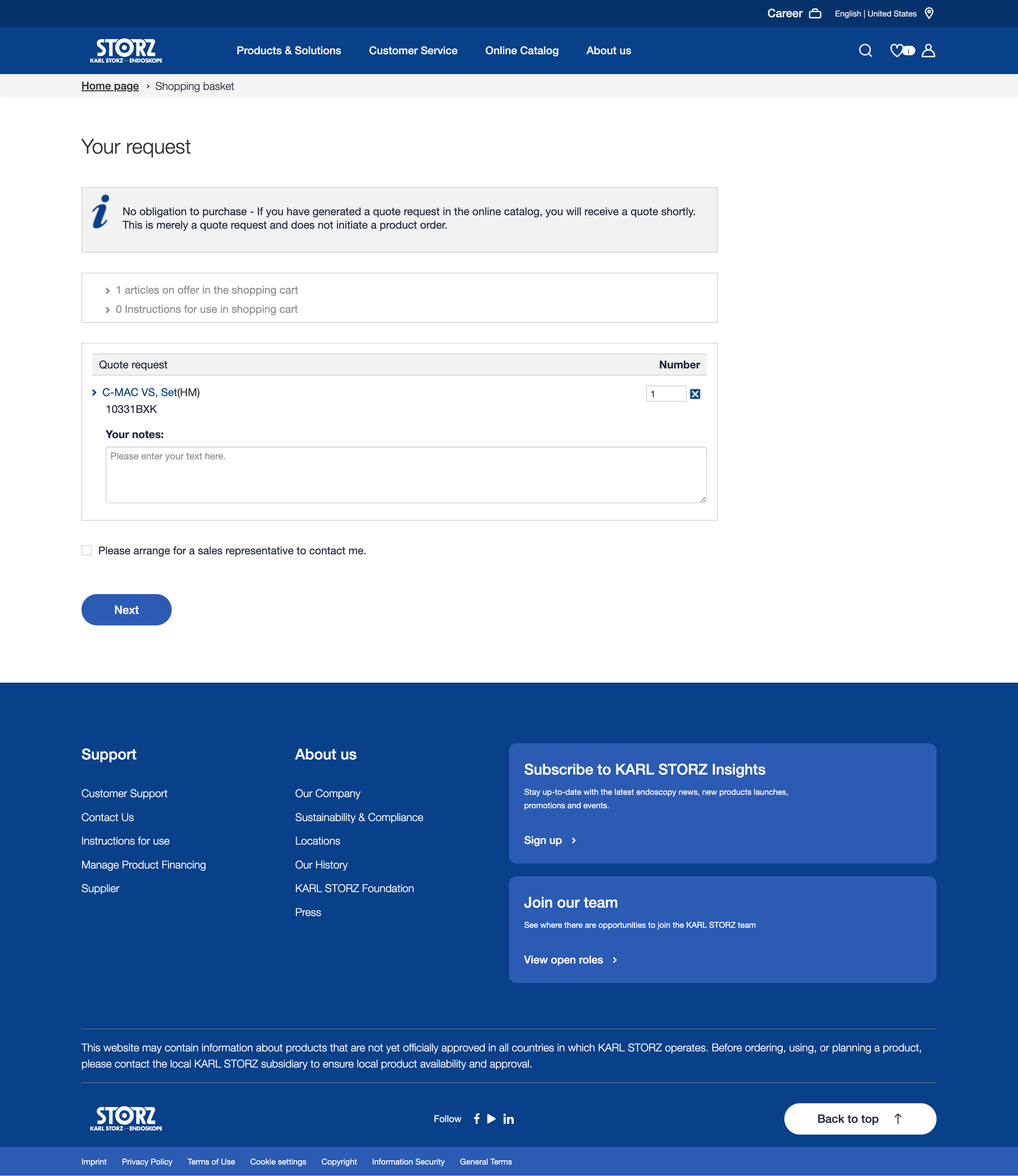
1. Renaming any mention of "Shopping Basket" in breadcrumbs to "Offer List"
Based on feedback, the term "shopping basket" created a transactional impression that discouraged users. By renaming it to "Offer List," we aimed to soften the approach and align the website more with a quotation or inquiry-based flow.

Before - Shopping Basket

After - Offer List
2. Clearer CTAs (Call-to-Actions)
We introduced prominent CTAs, such as "Add to Offer List," making it clearer that the user could start an inquiry or quote. Additionally, we highlighted the Contact Sales/Specialist option, giving new users easy access to personalized support.
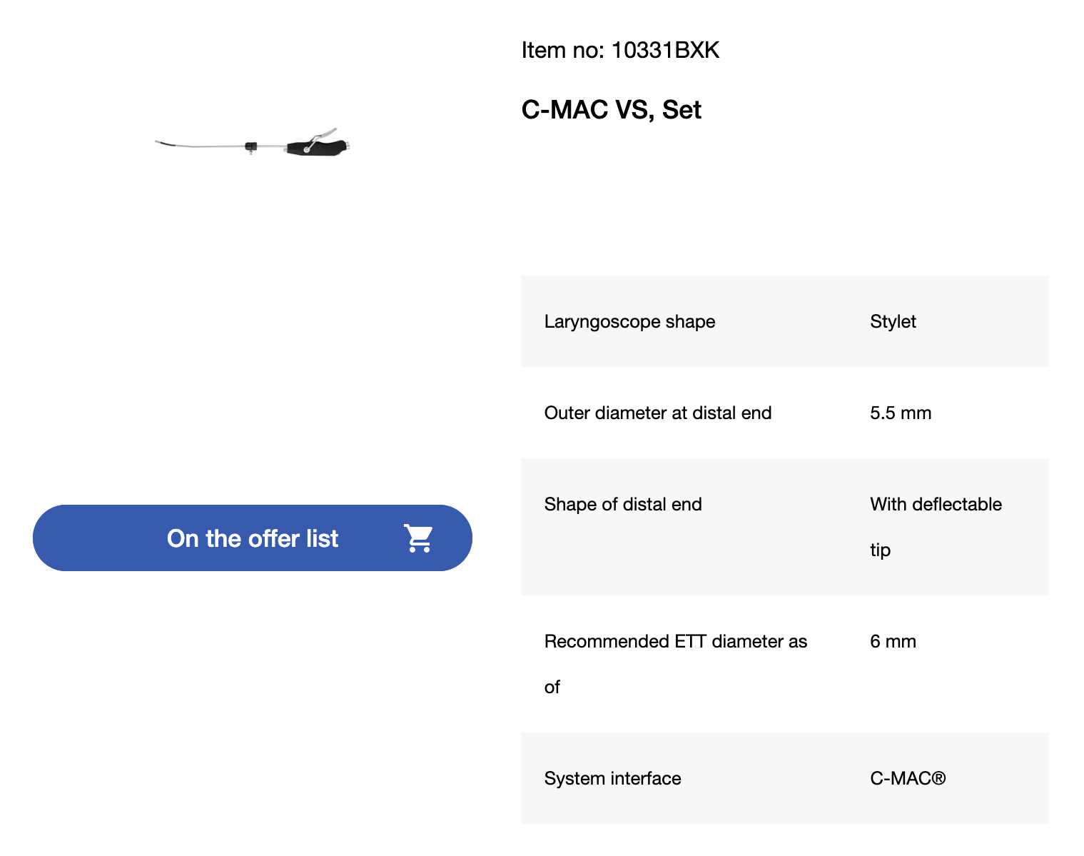
Before - CTAs
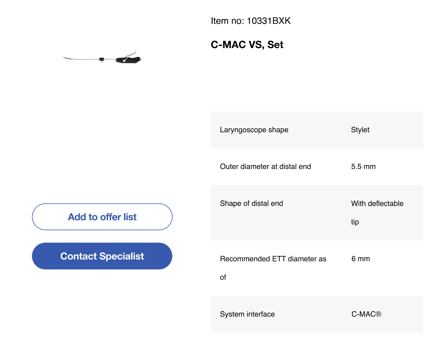
After - Clearer CTAs
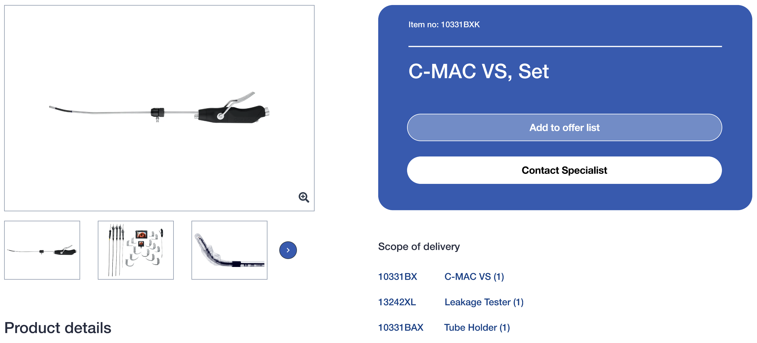
3. Product Overview and Detail Page Design Update
Both the product overview and product detail pages were updated to showcase two CTAs:
- Add to Offer List: Initiates the inquiry or quote process.
- Contact Sales/Specialist: Offers an easy way to ask for more personalized support.
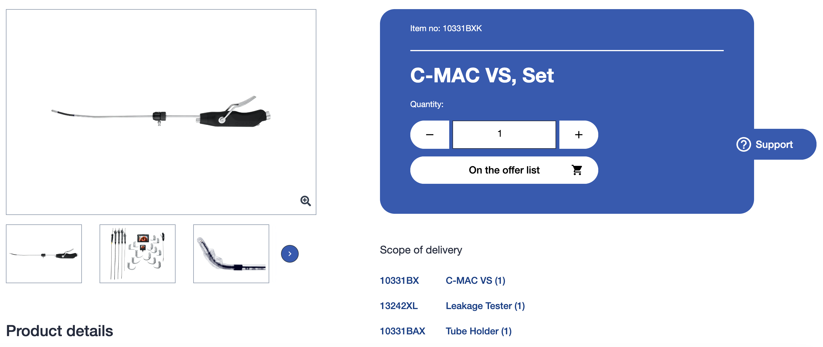
Before - Product Details Page
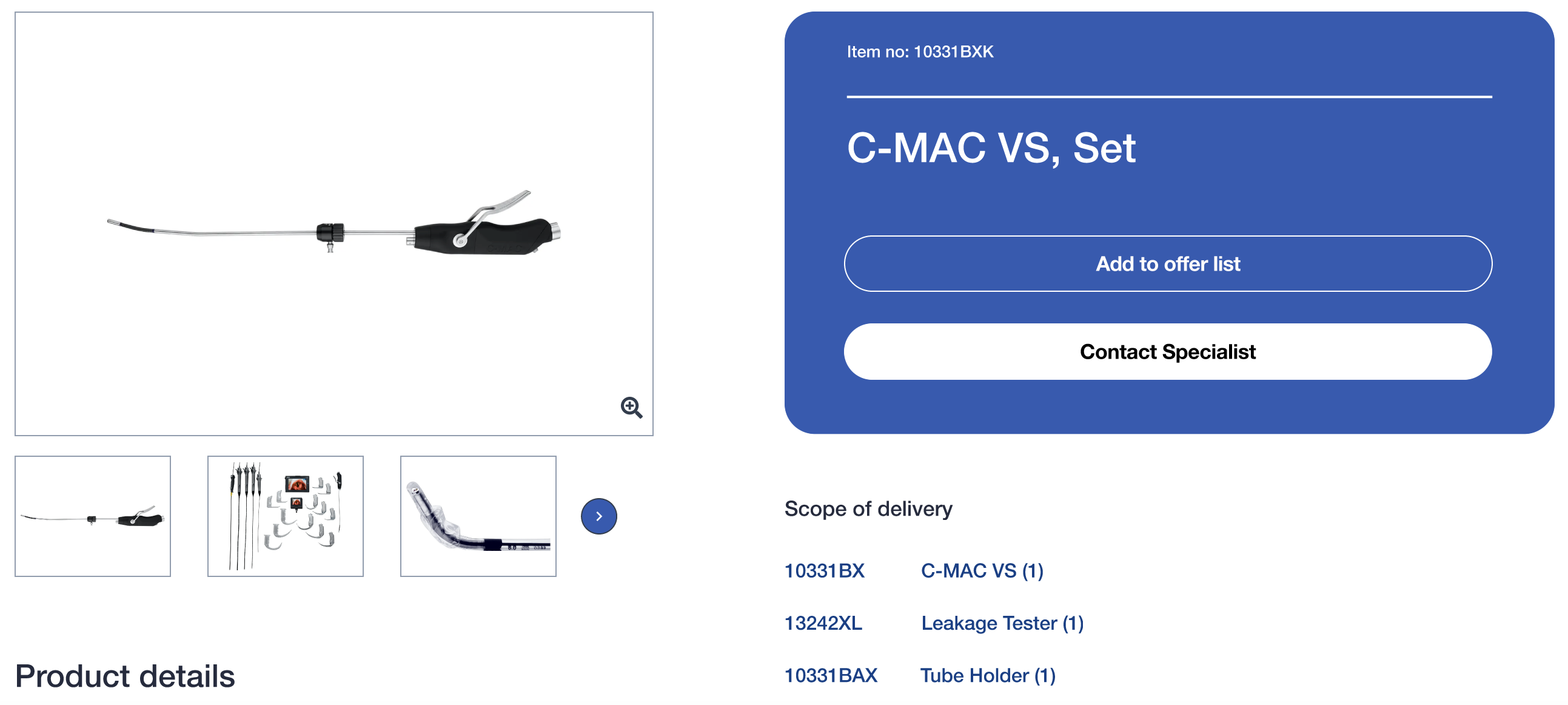
After - Updated CTAs
4. Overlay Feature with Hidden Quantity Inputs
To avoid overwhelming new users, quantity inputs were hidden. The "Add to Offer List" button now opens an overlay that allows users to adjust quantities only when they are ready. This prevents confusion while still providing the functionality for familiar users.
Quantity Inputs moved to overlay
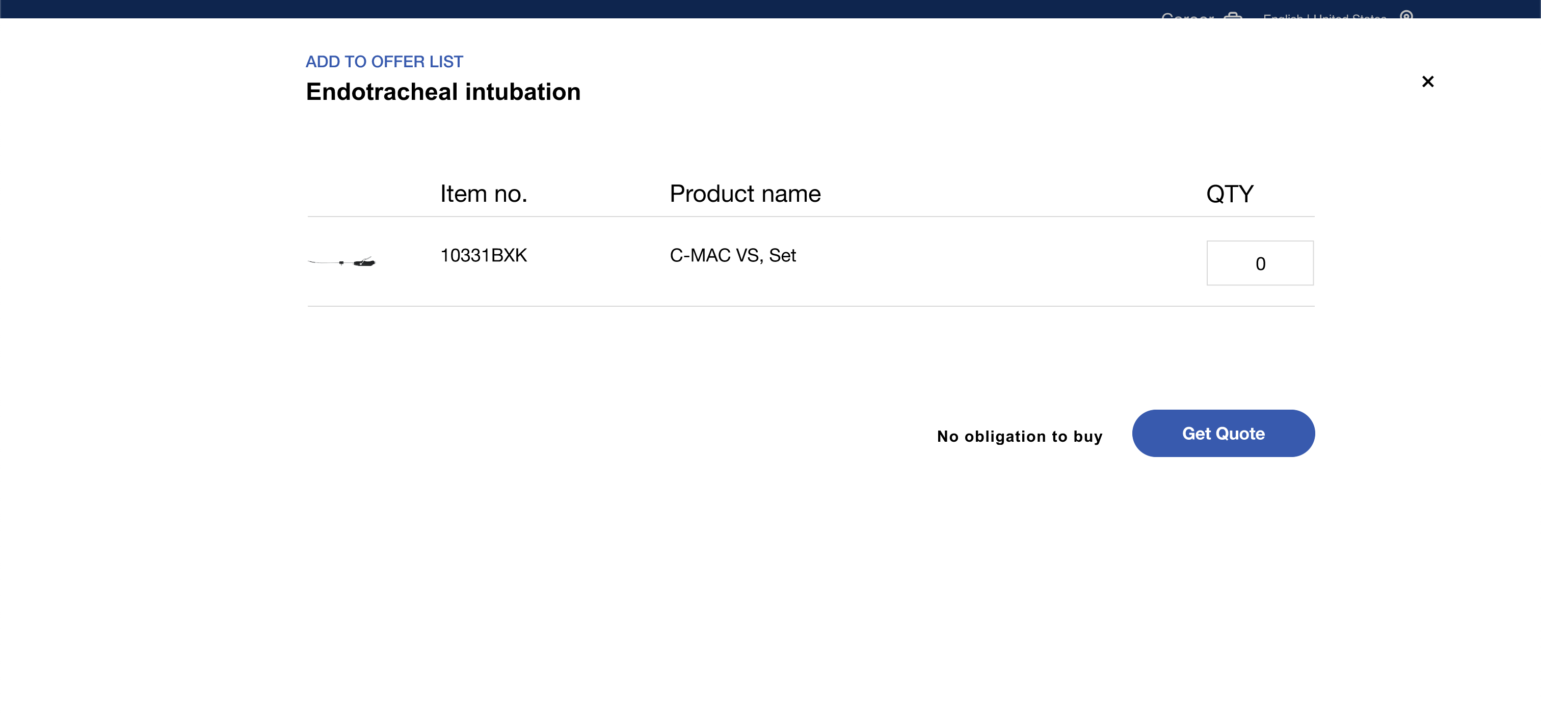
New - Overlay Feature
5. Icon Visibility and Update to List Icon
The "heart" icon was replaced by a "list" icon to better represent its intention. Additionally, the "Offer List" icon no longer appears by default. It is now hidden until the user adds a product to the offer list, reducing unnecessary distractions for users who haven’t interacted with the feature yet.

Default State

State 2 - Icon appears only when a product is added to offer list
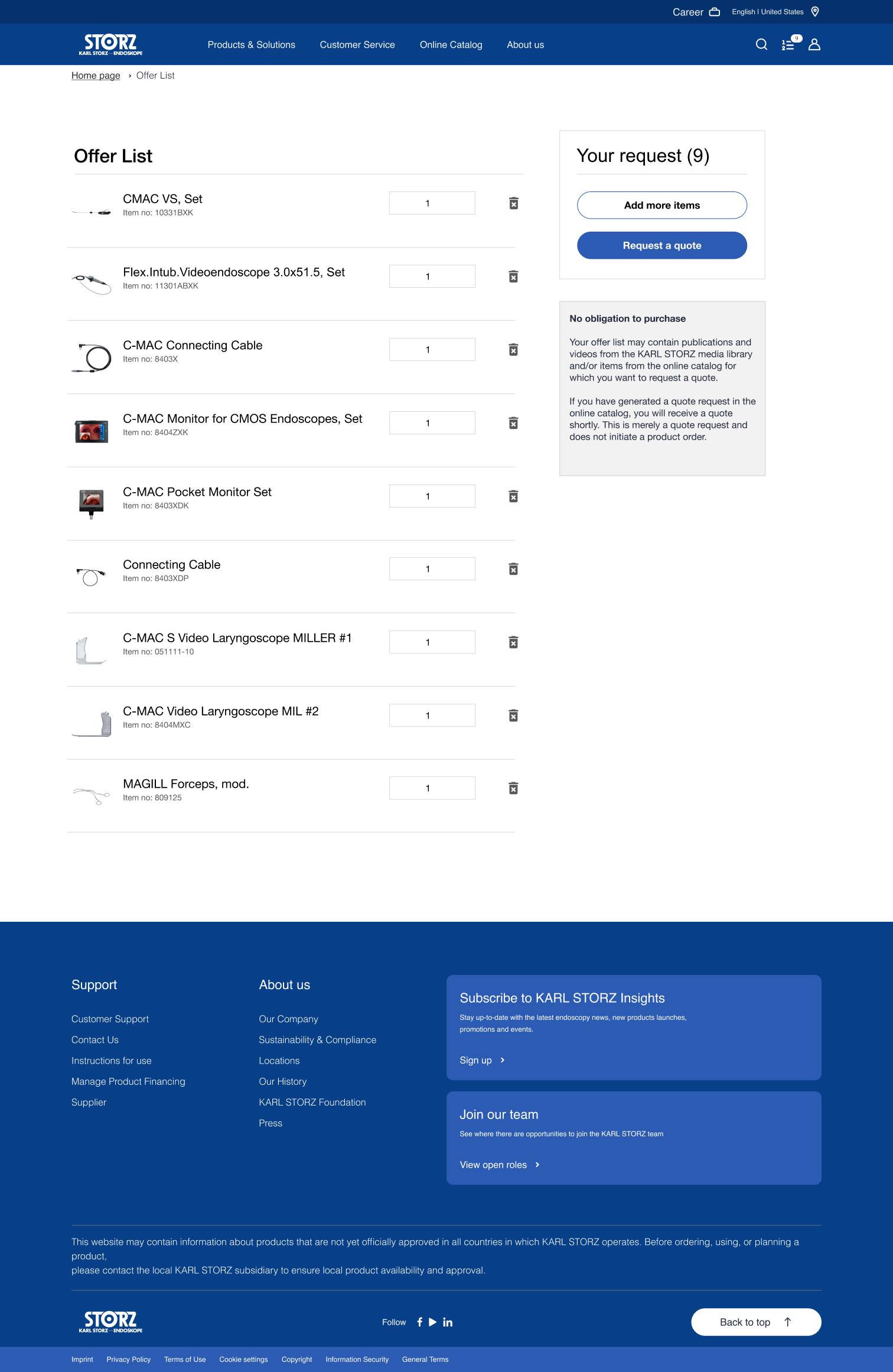
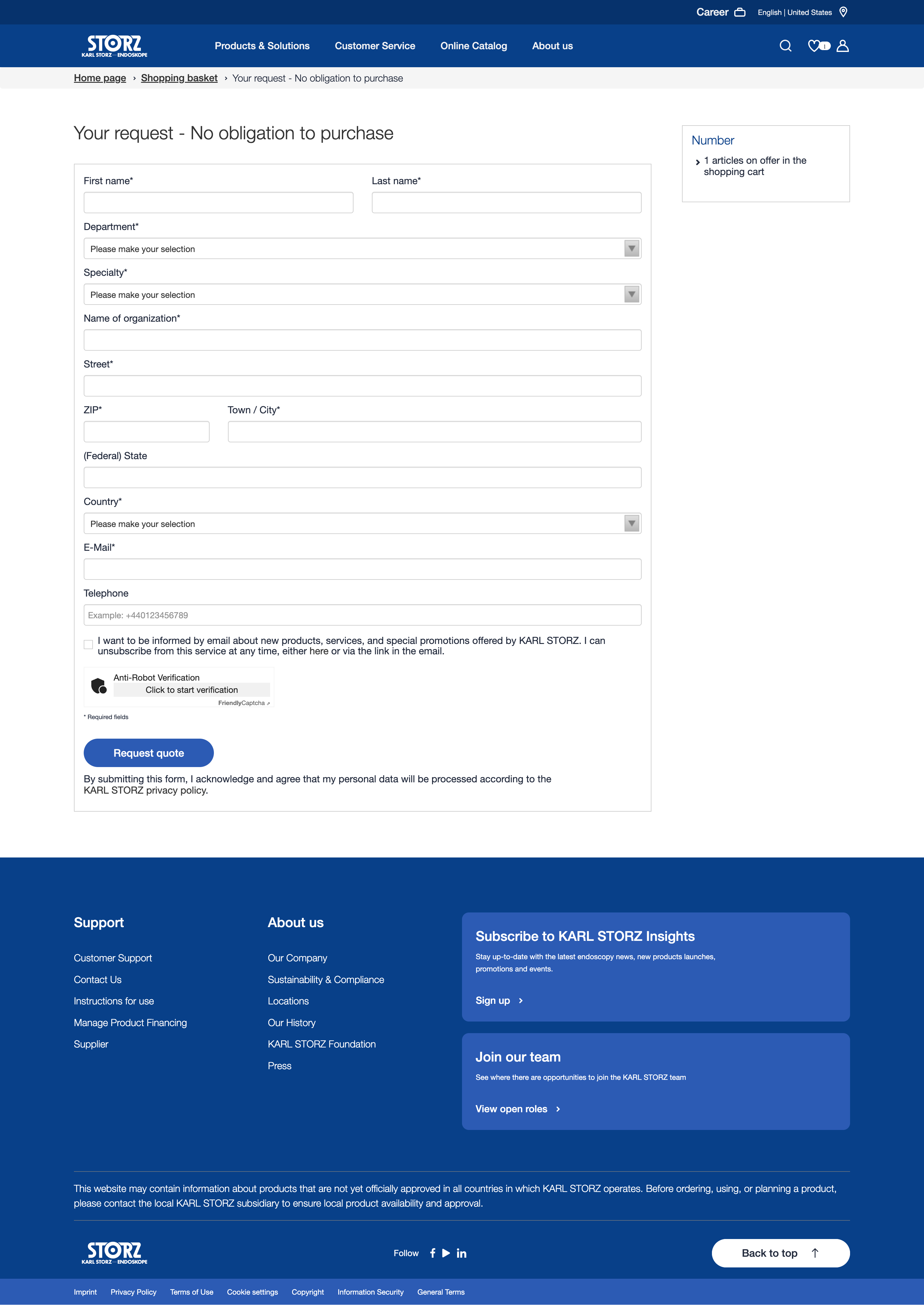
6. Fixed Right-Side Panel for Checkout Navigation
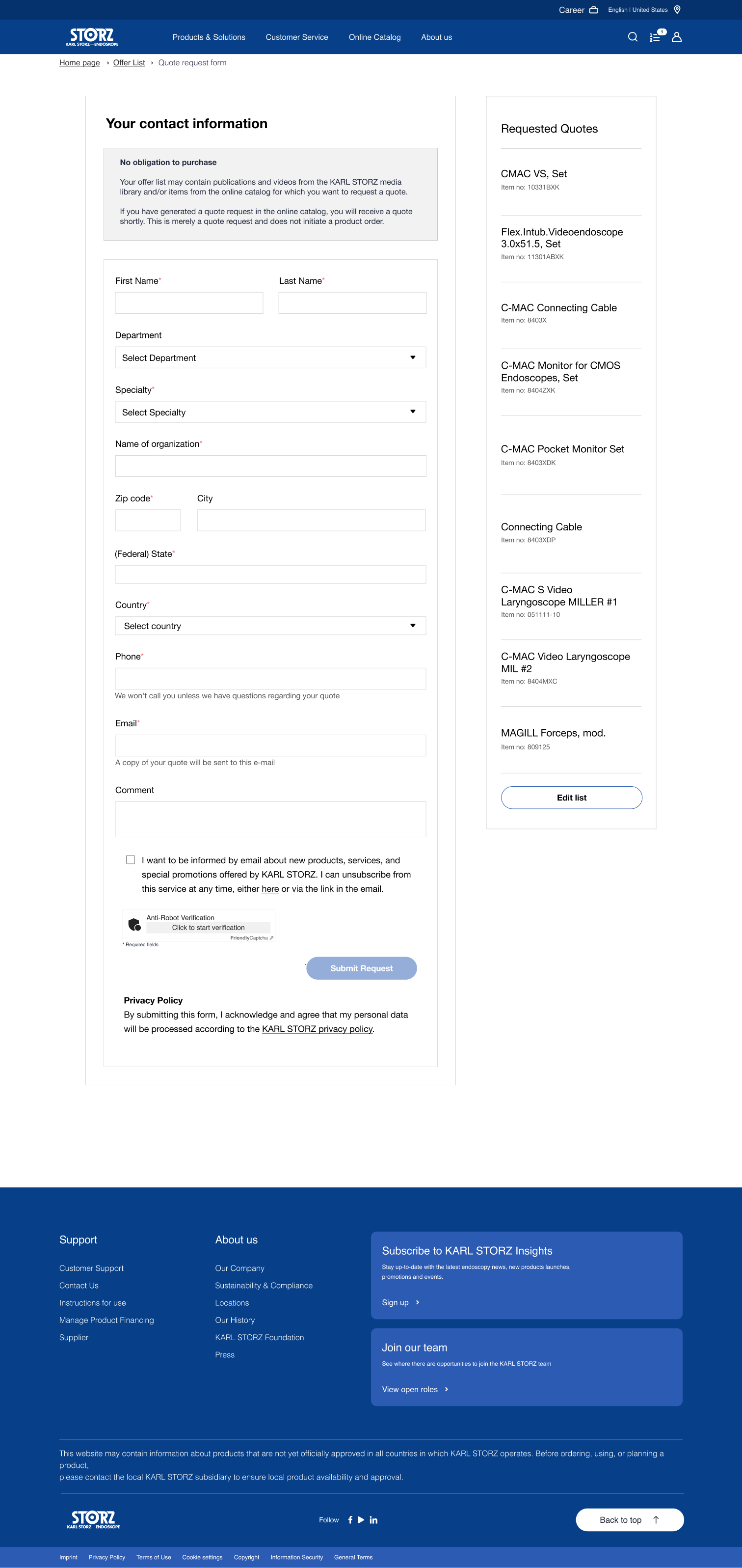
The "Offer List" page now includes a fixed right-side panel that helps users navigate the checkout process. Users can either choose to proceed with the checkout process or continue adding products to the offer list if they prefer.
Before - shopping basket
After - offer list
7. Clearer Headline for Right-Hand Side and labels in Checkout Form
We updated the headline on the right-hand side of the checkout form from "Number" to a more descriptive headline, "Requested Quotes," to better align with user expectations. Additionally, a clear CTA at the bottom of the right-hand side allows users to navigate back to the offer list to easily edit products if needed. Form labels have also been updated for a better representation of intention.
Before - Checkout Headline and form labels
After - Updated Headline & CTA with updated form labels
Challenge
Working on the redesign of the KARL STORZ catalog provided valuable insights, especially in navigating an established system. I had to work within the constraints of an existing design and development infrastructure, carefully examining the use of components like product cards, buttons, and typography. It was essential to ensure that any new elements, such as updated CTAs and the overlay feature, maintained consistency with the established design language.
However, this posed challenges when introducing new screens and functionality, particularly when trying to modernize the experience. Balancing the need for innovation while maintaining consistency with outdated elements, such as the rigid structure of the basket page, required thoughtful decisions to ensure both UI and UX improvements aligned with the existing framework.
Lesson Learned
There’s always room for refinement, but changes should be approached carefully, ensuring they serve both business goals and user expectations. Through this project, I learned the importance of balancing user needs with maintaining a cohesive experience.
For instance, the shift from "shopping basket" to "Offer List" initially surprised some users familiar with the previous flow. However, this adjustment ultimately enhanced clarity and improved engagement, proving beneficial for both new and returning users. Thoughtful modifications like these showed that sometimes strategic updates can lead to a smoother, more intuitive experience without overwhelming users with radical changes.
Mr. Moise applied extensive specialist knowledge confidently and skillfully, enhancing expertise through seminars and delivering committed, effective solutions.
Contact
Please use the form below to send me a message. I'll be happy to hear from you.